5 Mistakes You May Be Making With Your Website
5 Mistakes You May Be Making With Your Website…And How to Fix Them
We all make mistakes, and sometimes we don’t even know we’re making them. And how are you supposed to fix something you didn’t know was wrong in the first place? A familiar paradox, really, because a person doesn’t know what they don’t know.
We’ve compiled five website mistakes that we see all too often, and have proven solutions to these mistakes.
WARNING: Integrating these changes will present an awesome website that potential clients will relate to, trust and love.
Contact Information is Hard to Find
This is the most prominent blunder we see on mental health websites. We’ve all been there: Looking into investing in a new service, reading about the company, then leaving the website altogether when we have to dig around for contact information.
How do I fix this?
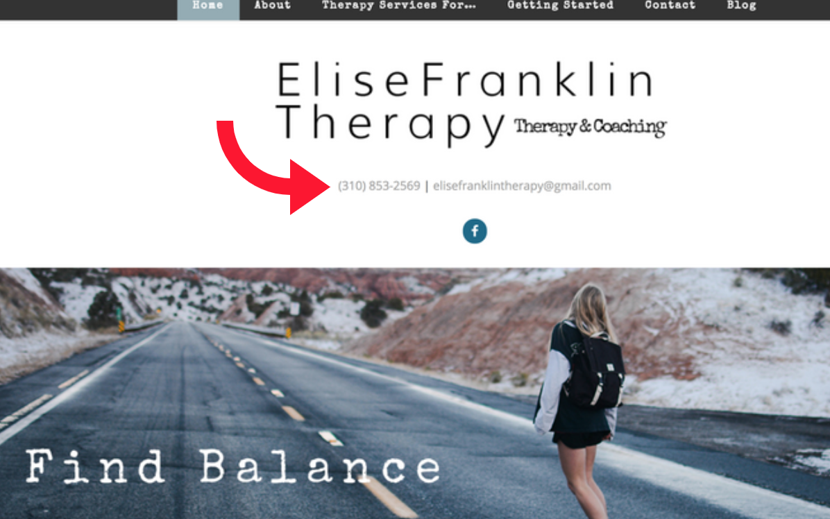
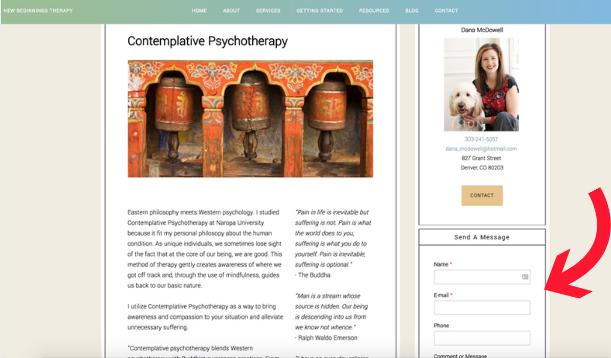
Add your contact information to every page. The easiest way to do this is by adding a sidebar with a contact form on every page or adding your contact information to the top of your website, site-wide.
Elise Franklin and Dana McDowell do a great job of displaying their contact information site-wide. Take note and take these options into consideration.
Too Much Psych Jargon
You’re an established, educated practitioner – that’s not something many people can say. But just as your eyes might gloss over when reading marketing materials stuffed with tech terms, your potential clients do the same when there are too many psych terms on your website.
How do I fix this?
Comb through your content. Remove psychological acronyms and spell out what you’re talking about. Remember that most people not in the mental health field aren’t going to know these terms. Try reading your website through your potential clients’ eyes.
Pro Tip: Keep in mind that your ideal clients care less about your credentials and more about if and how you can help them.
Cold as Ice Content
Even after taking out the psychobabble and replacing them with everyday words, your content may come across as off-standish, cold or impersonal, which is certainly not ideal. Professional doesn’t have to equal impersonal, and as a mental health professional, your website content should aim to create an emotional connection with potential clients.
How do I fix this?
WiredImpact has a few great tips on this, including:
- Writing how you speak – re-read your content and edit it so it sounds the same as when you’re speaking to someone in person.
- Using contractions – We don’t skimp on contractions while speaking out loud, and not using contractions in your website copy can make you seem robotic and not personable at all.
- Bringing your passion – You’re dedicated to the work you’re doing. Show off your passion and give inspiration to potential clients.
Confusing Navigation
Your potential clients are looking for a therapist because they’re looking for help. Don’t add an extra stress to their lives by having a confusing site navigation.
How do I fix this?
The main points potential clients are looking for are: who you are, what you do, how you can help them, and how to contact you.
We recommend having these primary navigation links:
Home | About | Services | Getting Started | Contact | Blog
This way, potential clients can navigate to the most important pages on your site, without having to forage their way through your website to the page they’re trying to view.
After you set these main navigation links, add ‘sub-menu,’ or drop down, options for multiple service pages, rates and insurance pages, etc.
Take a look at Kelly Battaglia of Thrive Counseling’s clean, clear and concise menu navigation below.
Bad Design
No one wants to travel back to ‘95 when viewing a website, so make sure your site is up-to-date with the trends of 2017 (No, you don’t have to have a trendy, all parallax website to be up-to-date with the times).
What we mean is, a website that looks outdated gives off the impression that the website content is outdated as well. Even if you write awesome blog posts and update your website often, potential clients will be turned off to contacting you under the impression that your practice isn’t up-to-date either.
How do I fix this?
With a free, 14-day trial of Brighter Vision’s services, of course.
At Brighter Vision we’re constantly researching top website design trends and integrating them into our themes. Hassle-free and worry-free, we’ll take the stress of creating a website off your hands so you can focus on what really matters — Helping people and changing lives.
Go ahead, enter your email. We know you wanna.
Get Started With a 14 Day Free Trial
And see how Brighter Vision can help you grow your practice:


Profound and effective suggestions for a Live and Client Friendly Website.
Congratulations Whitney.
Glad you found it helpful. Thanks for the kind words, Balaram!
Hey Whitney . Thanks a lot for including our tips on writing conversationally! Really appreciate it.
Thanks for your help as well, David!
Hi Perry, this article is really awesome and got so many important points from this content. Here I would like to add some points as of my experience as well.
I think Following are the five points will be useful for a website as well:
1 – User friendly website & Internal linking is another important point for generating more visitors. It will also help to reduce bounce rate for a website.
2 – Live chat is important as well. It will give complete support to users and help to make your website more user friendly.
3 – Call to action button is another key point for a website. It will help to convert your visitors into sales or customers.
4 – Conversion form or contact form should be also available in the Home page.
5 – Social media links and an attractive footer part for a website is much needed.
Thanks,