Before & After Website Transformations: From TherapySites to Brighter Vision
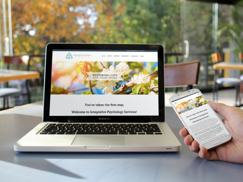
Your website is undoubtedly the most important online marketing tool you have. It is often the first impression you will make on a potential client, and a shocking 48% of people have reported a website’s design as the number one factor in determining the credibility of a business.
Day in and day out, you put your heart and soul into helping others. So why would you settle for a website that doesn’t depict that?
In order for your website to bring in new clients and help your practice grow, it’s important that it accurately represents you and the work you do every day.
In this article we will share our tips for a successful redesign of your therapist website. Then we will look at a few examples of websites we’ve recently redesigned for our clients who made the switch from TherapySites to Brighter Vision and they couldn’t be happier.
Already know you need a new website?
Skip to the good part and contact us now!
Tips for a Successful Website Redesign
Just like fashion and home decor styles change over time, so do website designs. And website styles have gone through quite a few changes even within the last 5 years. Gone are the days of busy backgrounds, flashing text, and cramming as much content “above the fold” as possible.
Today’s websites favor a more sleek, minimalist design. They also focus a lot more on user experience because the easier your site is to navigate, the more likely your visitors will be to contact you from it.
But, before jumping right into a full website redesign, it’s a good idea to have a clear plan in place.
Think about your website redesign project like a kitchen remodel – you wouldn’t start tearing out cabinets and countertops without knowing what you’re going to replace them with. You’d probably first spend some time watching HGTV shows or looking through “Kitchen Remodel” boards on Pinterest for inspiration.
Sure, your website redesign may not cost nearly as much as remodeling your kitchen – at least, it shouldn’t! – but it still deserves a fair amount of careful consideration and planning.
Here are a few questions to ask yourself:
- What do I like about my current website?
- What do I dislike about my current website?
- What do I want to achieve with my redesign?
- Who is my ideal client?
- How can I use my website to speak directly to ideal client?
Need help determining your Ideal Client? Take our Ideal Client Quiz now to find out, plus receive free marketing tips!
5 Website Transformations: From TherapySites to Brighter Vision
When building a website with Brighter Vision, our goal is to create something that perfectly represents your practice and effectively markets you to your ideal client. In order to do this, we pair each one of our clients with a professional development team to learn about you and your practice, making sure you are included in the design process at every step of the way. To learn more about how we work, check out our article on The Brighter Vision Process.
We’ve transformed many outdated therapist websites and brought them into the modern world. Take a look at some of our recent redesigns.
Brandis McFarland Mental Health Counseling, PLLC
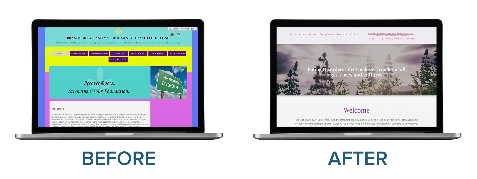
Looking at Brandis’s original website from her ideal client’s perspective, it was easy to see that it was in need of a serious makeover.
Given 15 minutes to consume content, two-thirds of people would rather read something beautifully designed than something plain. Considering that the majority of people who visit this particular website are looking for help reducing stress and anxiety, the overwhelming color scheme from the original site had to go.
On top of a new color palette, we redesigned this Brandi’s website with softer images, a new professionally designed logo, a smaller menu that was simpler for visitors to navigate, and a full-width homepage layout that condenses nicely on smaller devices such as a mobile phone or tablet.
Click here to view a side-by-side comparison of the full Homepage screen before and after this website’s redesign.
Anger Solutions New York
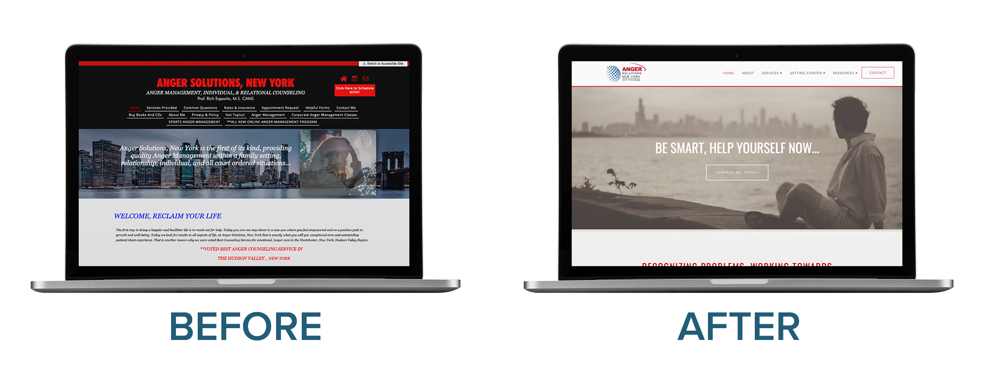
The original layout and color scheme for Anger Solutions New York had a very intense tone, the navigation menu was overly crowded, and white italic text over the New York City skyline gave the site a very busy look. All of these thing together didn’t exactly send a calming message to someone looking for help resolving anger issues.
By revising the layout using our new Denver theme, using a modern font, and softening the color scheme – this site now has a calmer, cleaner look that will appeal to those seeking out Anger Management Treatment.
Click here to view a side-by-side comparison of the full Homepage screen before and after this website’s redesign.
Flourishing Lives Counseling Center
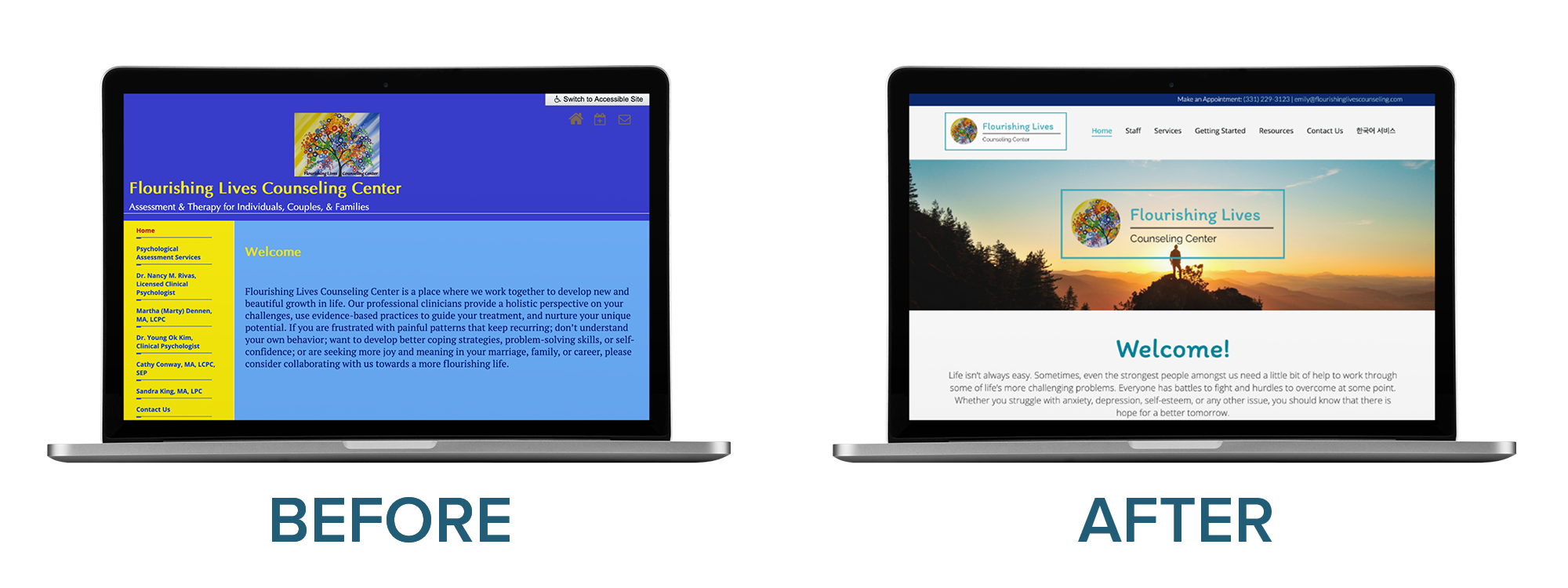
This practice’s original website was noticeably outdated and in serious need of a facelift.
Because of its vertical navigation menu running along the left side of the original site’s Homepage, there was a definite lack of balance between the layout and the page content. With too much empty space on a page, you’re likely giving the impression that your site may still be under construction.
The redesigned website is now laid out in a way where visitors can easily see their Specialty Services and click on the area they are interested in to learn more. It also nicely showcases all staff members and provides multiple ways for visitors to contact them throughout the homepage.
Click here to view a side-by-side comparison of the full Homepage screen before and after this website’s redesign.
Hope Revealed Behavioral Health Center, Inc.
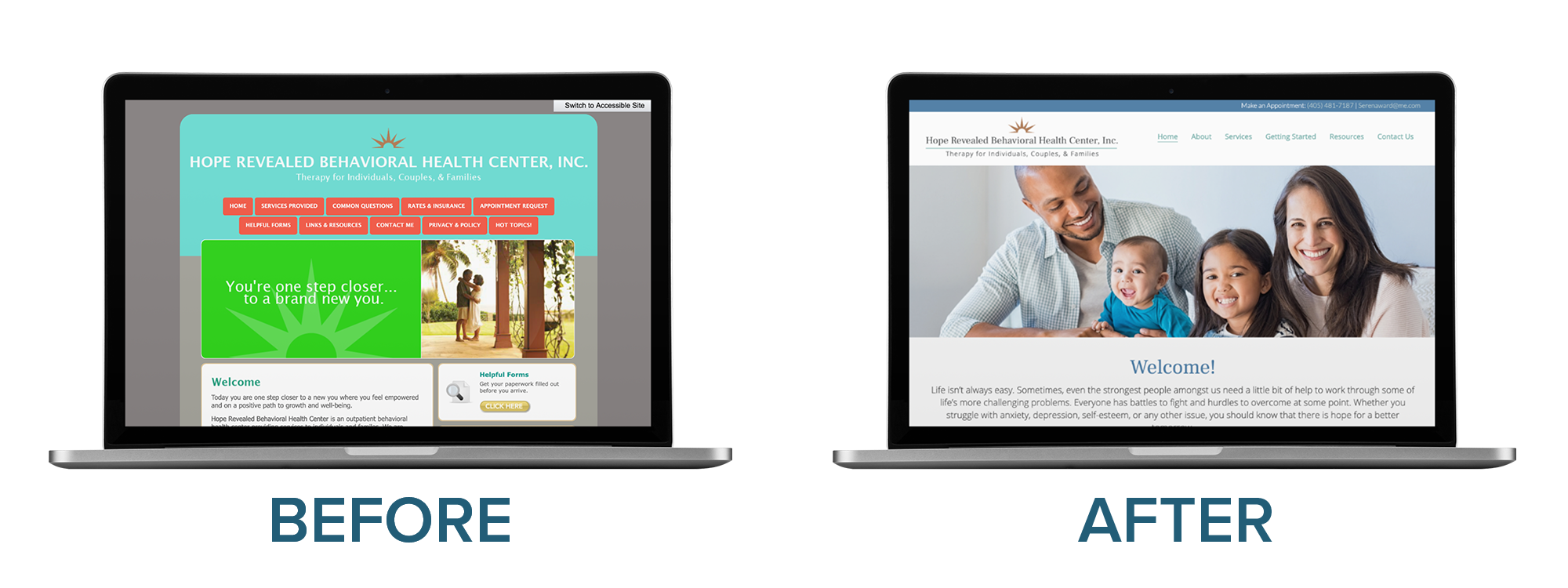
While some of the colors on this original website were nice, combined together they looked like something from one of Jane Fonda’s 80s aerobics classes.
But the biggest change in our redesign wasn’t even the color scheme – it was all in the layout.
By focusing on creating a positive user experience and determining what their ideal client was looking for, we were able to provide more information on the Homepage of Hope Revealed’s website by splitting it up into distinct sections. Doing so allows them to educate website visitors in a way that is both aesthetically pleasing and easy to navigate.
Click here to view a side-by-side comparison of the full Homepage screen before and after this website’s redesign.
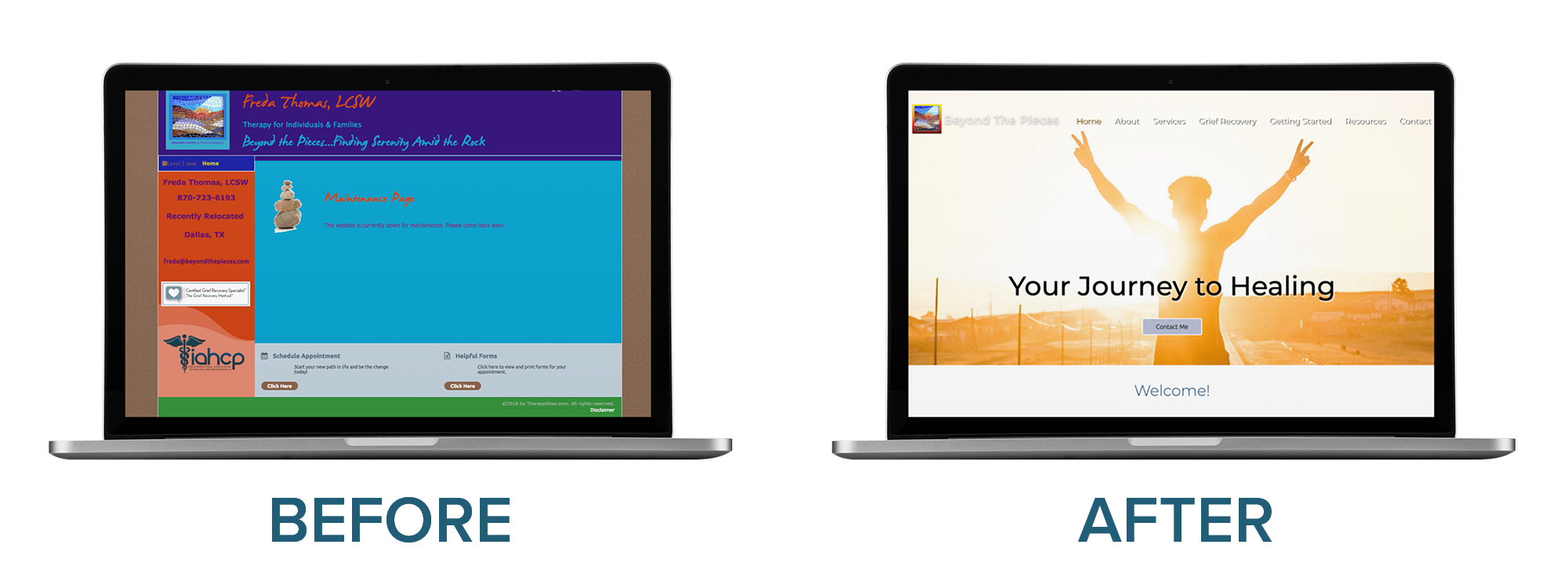
Beyond The Pieces
By using bold, contrasting colors and a font that was so difficult to read, Beyond The Piece’s website may have unknowingly been deterring potential clients.
In the redesign, we used a more professional color scheme and new fonts that better represented the personality of the brand. We also integrated multiple ways to contact throughout the Homepage and embedded a Google Map to make finding her practice easy for new clients.
Click here to view a side-by-side comparison of the full Homepage screen before and after this website’s redesign.
Partner up with Brighter Vision for Your Website Redesign
As we said before, your website can have a substantial impact on the success of your practice. Not only should it look good, it should also have the right content to attract new clients, make it easy for them to contact you, and engage with your existing clients as well.
Get inspired by Brighter Vision’s portfolio of therapist, psychologist, and counselor website designs.
Need help figuring it all out? We’re here to help!
If your private practice website isn’t quite up to par, contact us today to learn more about our website redesigns and online marketing solutions for therapists.


