Choosing the Right Color Palette for Your Private Practice Website
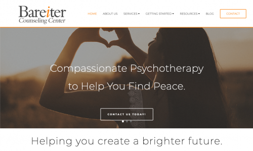
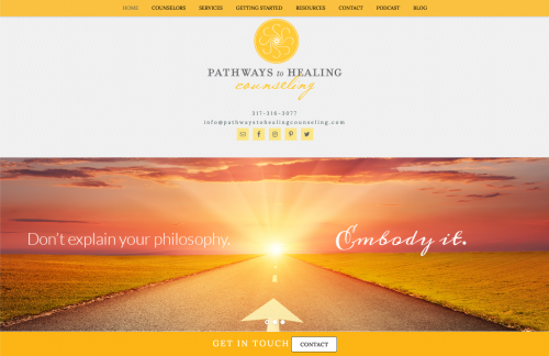
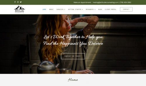
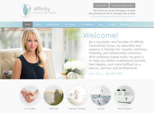
The colors you use on your website have the power to capture the attention of your ideal client, influence their emotions, and provide them with a sense of what your practice can provide – all before they’ve even read a single word.
With so much pressure on choosing the right color palette, how do you know what will work best for your private practice website?
Just like any other element of marketing is concerned, when it comes to your website, color has to be used in the right way, for the right purpose, and for the right audience.
In this article, we’ll talk all about the psychology of color in general, we’ll cover the meanings of each color and the feelings they elicit, then we’ll share some of our favorite resources to help you find the perfect color palette for your private practice website.
Opening a Private Practice?
Sign up for our free email course to learn the 6 most important steps you should take when opening a private practice.
The Psychology of Color
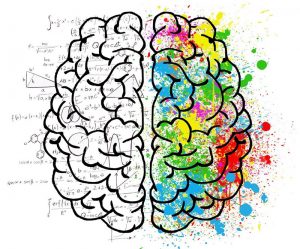
Color psychology is the study of how colors influence human emotions and behavior.
When we see a color, our eyes send a signal to a part of our brain known as the hypothalamus, which then communicates with our endocrine system to release hormones that cause fluctuations in our mood, emotions, and resulting behaviors. In other words, color stimulates our brain and wields enormous sway over our attitudes and feelings.
A well-known color study titled “Impact of Color on Marketing” taught us that it takes a mere 90 seconds for a customer to form an initial opinion about a product or brand and as much as 90% of this conviction is determined by color alone.
That means choosing the wrong color palette for your private practice website may end up driving potential clients away, even if they really do need your services. Yikes!
But how do you know if you’re choosing the right color palette?
Hint: it’s not by using your favorite colors.
Design Your Website for Your Ideal Client
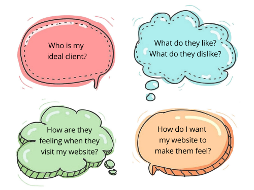
To find the right color palette for your website, you’ll need to study your ideal client and base your decision on what will best appeal to them.
Ask yourself questions like…
Once you’ve answered these questions, you’ll be in a much better position to identify the colors you should use on your website.
Need help finding your Ideal Client?
Take our Ideal Client Quiz now to find out, plus get free custom marketing tips!
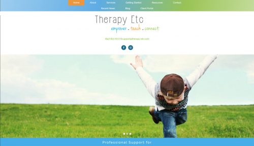
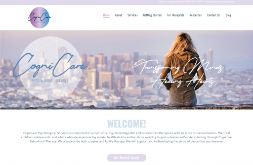
For example, if you work primarily with children providing services like play therapy or art therapy, you aren’t going to want to have a black or red website. Props, Therapy Etc for creating a website with a color scheme that perfectly depicts the work you do.
For a children’s therapy site, you want to use bright and vibrant colors – probably some blues, reds, greens, and maybe a splash of orange or yellow for that extra kick of youthfulness.
However, if you work primarily with new mothers struggling with postpartum depression or teens trying to cope with ADHD, you’ll want to go a very different route with your website’s color palette – one that will appeal specifically to that audience using much less stimulating colors.
What Your Colors Are Telling Your Ideal Client
In order to truly succeed with color psychology, you’ll need to not only understand your ideal client but also the traditional meanings behind the colors you’re using as well as the emotions they illicit.
Obviously, the way color is perceived may vary slightly from one person to another. But there are commonalities between numerous color studies that suggest general perceptions and emotions tied to each one.
So now, let’s dive a little deeper into each color individually:
Red
| Positive: Power, Passion & Excitement | Negative: Caution, Danger & Evil |
Almost universally, red means stop. Red means danger. Red means hot. Red means love. And red means evil. It is an extremely stimulating color to say the least.
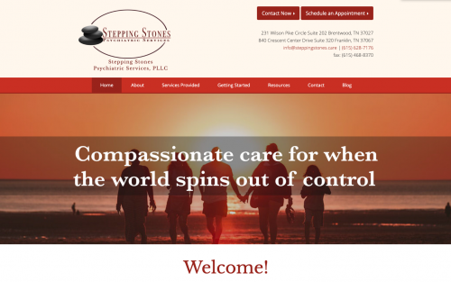
For these reasons, it is often considered a “questionable” color choice for health care sites. So, if you are going for a more relaxed atmosphere, you may want to steer clear of a red color palette.
However, in the right context, it could certainly work to your advantage. For example, if you work primarily with couples who want to strengthen their bond and intensify the passion within their relationship, red may be a perfect choice.
Orange
| Positive: Friendliness, Uniqueness & Courage | Negative: Urgency & Stress |
The color orange radiates happiness, combining the vibrant energy of red and the cheerfulness of yellow. When used correctly, it can create a warm, welcoming feeling for your website visitors that invites them to learn more. This color is a popular choice for Child Therapy websites.
It is also known to emphasize urgency so this can be a good color to use for CTA buttons (call-to-action). One of the leading landing page builders, Unbounce, made a case that the future of web design is BOB: Big Orange Button. A Wider Funnel test then validated this with a case study that showed a Big Orange Button resulted in a 32.5% increase in conversions.
That being said, if you’re going to use orange for your CTAs, you do want to make sure it fits in with the rest of your color palette. And we recommend using this color sparingly to avoid overwhelming your website visitors.
Yellow
| Positive: Joy, Energy, Warmth & Healing | Negative: Anxiety & Cowardice |
Yellow is most commonly thought of as “the happy color”. For most people, it produces a warming effect, it stimulates mental activity, and it arouses feelings of cheerfulness or optimism. It’s no wonder so many therapists choose this color when designing their private practice website.
Yellow is also another popular color choice for CTA buttons. VegasSlotsOnline.com reported that changing their CTA button reading “Sign Up Here!” from green to yellow increased conversions by 175%.
However, just like orange, yellow has also been reported to have a disturbing effect and arouse anxiety on some audiences. To avoid arousing unnecessary apprehension and overwhelming your visitors, go easy on your use of the color yellow. Blend it in with other colors to create a nice, welcoming palette.
Green
| Positive: Growth, Nature, Harmony & Luck | Negative: Envy & Jealousy |
Green is one of the colors that can be beneficial in terms of reducing anxiety and bringing about a calmer state of mind. Since anxiety is one of the most prevalent psychiatric disorders in the general population, it makes green a great color choice for a wide array of mental health websites.
The color green also signifies growth, healing, and renewal which are all relevant to therapy websites.
Blue
| Positive: Tranquility, Trust & Reliability | Negative: Sadness & Depression |
Blue is one of the most commonly used colors among all types of websites and branding, with good reason. A lot of people like blue. In fact, a popular study showed that blue is the most favored color by 57% of men and 35% of women – with 42% of the overall study group listing blue as their favorite color.
The color blue is often associated with calm and relaxing emotions as well as trust and reliability, which makes it a perfect choice for nearly any private practice website.
Bonus Tip: The color blue is seen by everyone – even colorblind people!
Purple
| Positive: Wealth, Power, Royalty | Negative: Extravagance |
The color purple combines the stability of blue and the energy of red. But the hue of purple you choose can significantly change the feeling of your entire website. Depending on the shade you use, it can be peaceful and tranquil or it can be considered stimulative.
Purple has also long been known as the color of royalty; representing wealth, power, and authority.
For mental health websites, a purple color palette may be a good or bad choice, depending on your ideal client. We commonly see this color used by practices who primarily provide Yoga and Meditative services.
Additional Resources to Help You Find a Color Palette for Your Private Practice Website
If you’re still struggling to come up with a color palette for your private practice website after determining your base color(s), there are a few resources that you can use to find the perfect palette.
Here are some of our favorite websites to use when dealing with color and creating color palettes for our own clients:
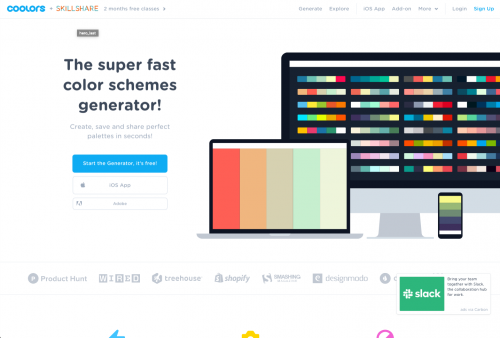
Coolors
We love using Coolors because it’s so easy to use. Within seconds you can create, save, and share color palettes with their online generator – no downloads required. Simply click the space bar until you find a palette you like.
You can also choose an image to base the color combination you want and with this tool, you’ll be able to modify and refine the colors. Or, you can browse thousands of pre-made color palettes to find the perfect choice for your website.
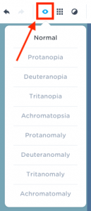
Another particularly fantastic feature of Coolors is their Color Blindness feature that allows you to view any color palette through the eyes of someone who experiences a color deficiency.
Colormind
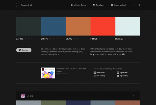
Colormind is another great free online color palette generator that functions a lot like Coolors. You can generate color palettes entirely at random. You can also create a palette based on a color you’ve already decided on by “locking” it on and generating from there.
Hot Tip: If you have two complementary colors in mind already, try locking them to the opposite ends of your palette. Colormind will generate nice intermediate values for you.
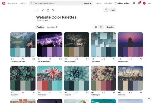
Brighter Vision’s Pinterest Board
We’ve also made it incredibly easy for you to choose a color palette for your private practice website based on some of the more popular combinations we’ve used in the past.
Browse our ever-growing collection of beautiful color palettes specifically for therapist websites.
The Bottom Line
The colors you use on your private practice website should set the appropriate emotional tone, so choose colors that are congruent with your services; colors that will inspire your ideal client to contact you.
The first step to creating a killer private practice website is understanding your ideal client. Once you’ve done this, everything else will begin to fall into place 🙂
Want the beautiful therapist website you deserve? Then you’re in the perfect place.
Brighter Vision is the ultimate marketing package for therapists, centered around the best therapist website you’ve ever had. Fill out the form below to learn more about our team of professionals who can’t wait to help your practice grow like never before 🙂


